Hoverable Dropdown in HTML and CSS — Custom Design

Dropdowns are fundamental UI components that display a list of options when triggered. They are versatile, user-friendly, and a staple in modern web design.
This guide walks you through creating a basic dropdown and customizing it into a hoverable dropdown only using HTML and CSS but not JavaScript single line of code.
What is a Dropdown?
A dropdown is a UI element that displays a list of links or options when triggered, typically with a click or hover action. By grouping related links in a compact form, dropdowns can simplify navigation and improve the user experience.
Default Dropdown
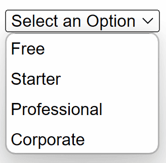
The select tag creates dropdown lists option tags define selectable values. The default value of the select element can be set by using the ‘selected’ attribute on the required option. This is a boolean attribute. The option that has the ‘selected’ attribute will be displayed by default on the dropdown list.
html<!DOCTYPE html> <html> <head> <title>Default Dropdown in HTML and CSS</title> </head> <body> <p>Choose your plan below:</p> <select name="plan" id="plan"> <option value="none" selected disabled hidden>Select an Option</option> <option value="free">Free</option> <option value="starter">Starter </option> <option value="professional">Professional</option> <option value="corporate">Corporate</option> </select> </body> </html>
The style of the default dropdown is defined by the browser (Edge, Safari, Chrome, etc) itself so it will be different for each. It will look like this:
Custom Hoverable Dropdown
Hoverable dropdowns eliminate the need for a click by displaying the menu when the user hovers over the button. Below is a detailed explanation of the custom hoverable dropdown code:
HTML
The HTML structure remains straightforward. div with the class dropdown contains:
- A button styled as .dropbtn to serve as the hover trigger.
- A div with the class .dropdown-content that holds the menu items, which are a tags linking to external resources.
html<div class="dropdown"> <button class="dropbtn">🧑🦱</button> <div class="dropdown-content"> <a target="_blank" rel="noopener noreferrer" href="https://medium.com/@tajammalmaqbool11">Follow On Medium</a> <a target="_blank" rel="noopener noreferrer" href="https://www.patreon.com/TajammalMaqbool">Follow On Patreon</a> <a target="_blank" rel="noopener noreferrer" href="/">Visit Website</a> <a target="_blank" rel="noopener noreferrer" href="contact@tajammalmaqbool.com">Mail Now</a> </div> </div>
CSS
.dropbtn has a green background, white text, and padding to make it visually appealing. A hover effect changes the button’s background to a darker green.
.dropdown-content initially hidden using display: none and positioned absolute under the button. Styled with a light background, subtle shadow, and padding for a polished appearance.
The selector .dropdown:hover .dropdown-content ensures the menu becomes visible (display: block) when the user hovers over the dropdown container. An additional hover effect for .dropdown-content a changes the background color for better interactivity.
css.dropdown { position: relative; display: inline-block; } .dropbtn { background-color: #4CAF50; color: white; padding: 10px; font-size: 32px; border: none; cursor: pointer; } .dropdown-content { display: none; position: absolute; background-color: #f9f9f9; box-shadow: 0px 8px 16px rgba(0, 0, 0, 0.2); z-index: 1; min-width: 200px; } .dropdown-content a { color: black; padding: 12px 16px; text-decoration: none; display: block; } .dropdown-content a:hover { background-color: #f1f1f1; } .dropdown:hover .dropdown-content { display: block; } .dropdown:hover .dropbtn { background-color: #3e8e41; }
Full Code
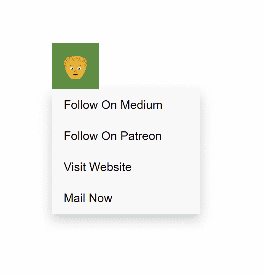
Copy and Paste the code then see the nice-looking dropdown.
html<!DOCTYPE html> <html lang="en"> <head> <meta charset="UTF-8"> <meta name="viewport" content="width=device-width, initial-scale=1.0"> <title>Hoverable Dropdown in HTML and CSS</title> <style> body { font-family: Arial, sans-serif; margin: 0; padding: 0; } .dropdown { position: relative; display: inline-block; } .dropbtn { background-color: #4CAF50; color: white; padding: 10px; font-size: 32px; border: none; cursor: pointer; } .dropdown-content { display: none; position: absolute; background-color: #f9f9f9; box-shadow: 0px 8px 16px rgba(0, 0, 0, 0.2); z-index: 1; min-width: 200px; } .dropdown-content a { color: black; padding: 12px 16px; text-decoration: none; display: block; } .dropdown-content a:hover { background-color: #f1f1f1; } .dropdown:hover .dropdown-content { display: block; } .dropdown:hover .dropbtn { background-color: #3e8e41; } </style> </head> <body> <p>Custom Hoverable Dropdown Using HTML and CSS without JavaScript</p> <div class="dropdown"> <button class="dropbtn">🧑🦱</button> <div class="dropdown-content"> <a target="_blank" rel="noopener noreferrer" href="https://medium.com/@tajammalmaqbool11">Follow On Medium</a> <a target="_blank" rel="noopener noreferrer" href="https://www.patreon.com/TajammalMaqbool?utm_medium=unknown&utm_source=join_link&utm_campaign=creatorshare_creator&utm_content=copyLink">Follow On Patreon</a> <a target="_blank" rel="noopener noreferrer" href="/">Visit Website</a> <a target="_blank" rel="noopener noreferrer" href="contact@tajammalmaqbool.com">Mail Now</a> </div> </div> </body> </html>
It will look like this:
Conclusion
This hoverable dropdown is simple yet effective, providing a seamless user experience. It demonstrates the power of basic CSS and HTML for creating interactive web components without relying on JavaScript.
Follow and Support me on Medium and Patreon. Clap and Comment on Medium Posts if you find this helpful for you. Thanks for reading it!!!


